I wanted to write a post pre-election to note down some of my thoughts, but never found the time to do so. Instead, I did some Instastories just to document my quick thoughts. In this post, I’ll focus just on the Presidential election and will keep the Senate and House out of the discussion. The data used in this post are correct as at 8th November 1pm.
If you are interested, here was my prediction before the elections.
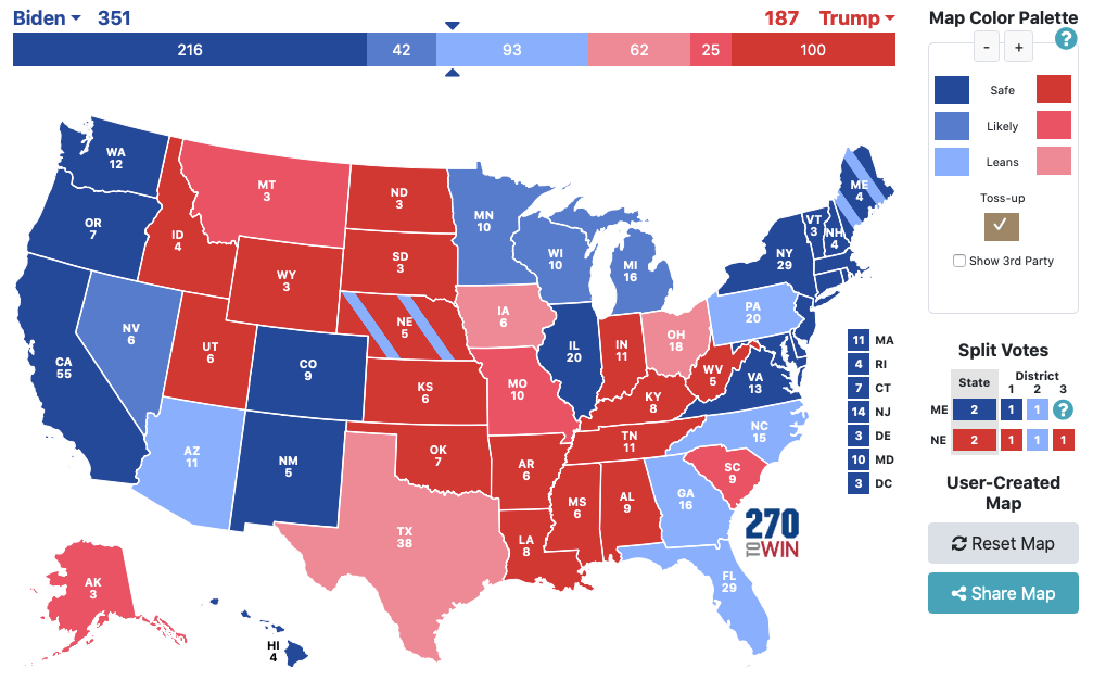
To me, the states in sky blue and pink were really toss ups, but I characterised them based on reading and understanding the demographic shifts in those states over the years. Here are the “results” (it really isn’t a result because States have until December to publish their official results).
In general the results are as expected, only 2 States (Florida and potentially North Carolina) and 1 Congressional District (Maine 2nd) was wrongly characterised. But that aside, Let’s talk about the side-effects of politics.
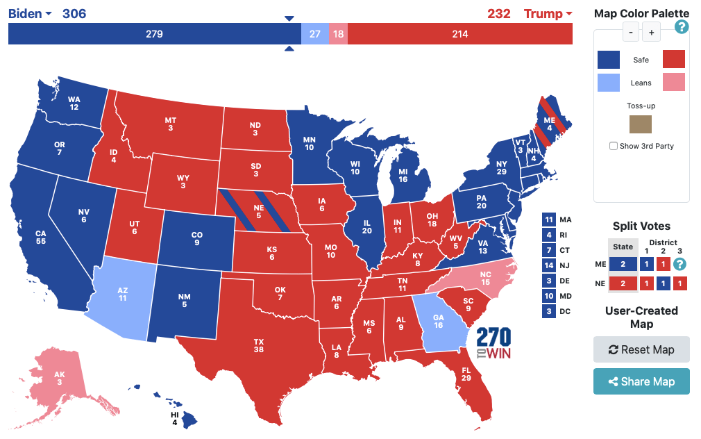
Every 4 years, we see a coloured map of the US and this year it looks like this:
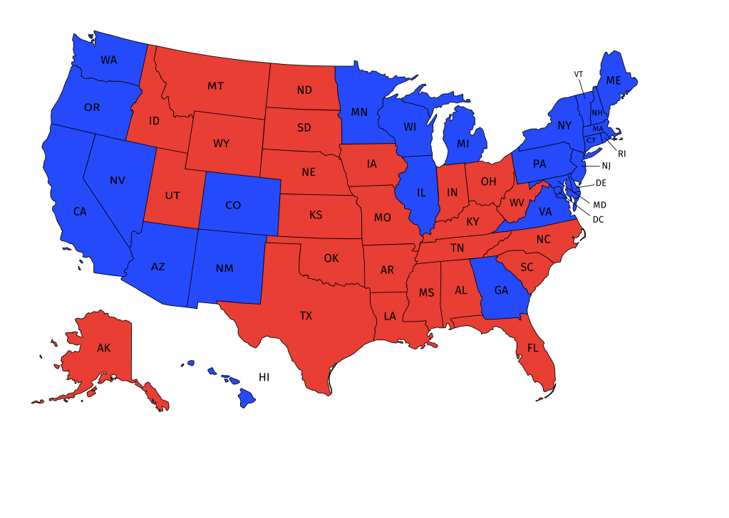
The presence of bright red and blue portrays a picture of polarisation in the nation. It gives a sense of Left vs Right. This is a result of politics and the need to choose 1 of 2 (real) choices. But really, States are not Red or Blue but a combination of representation of Republicans and Democrats. This made me ask the question: What happens if we consider the vote share in each state and use a range of colours to visually represent how States voted for President?
So what I started to do is to import the current vote counts of each State and the vote share of each candidate. I calculated the percentage of votes in Excel and condition format the data to show me how “Left” or “Right” leaning the states really are. I created a continuous colour spectrum to represent the scale between Red and Blue, with “Blue” representing 100% Democrat vote share and “Red” representing 100% Republican vote share. All other vote shares lies between the traditional red-blue divide.
After staring down at the US map for so many months, I expected to see a map that is still generally red and blue. I always thought that there are States that are “bright red” or “bright blue”. I was taken aback by the final results. Here it is:
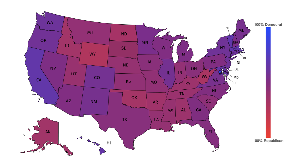
The most polarised “State” and it is written in quotation marks because it really isn’t a state, is D.C. The nation’s capital is actually the most polarised with 80+% voting for Joe Biden. On the other hand, the State that is most Red is Wyoming (also the least populated state) with ~45% Republican votes. The rest are really a mixture. While the US is more polarised than before, there are still more things that Americans agree on than what divides.
The point I want to make is that politics can make everything look polarising. But if we strip down the competition, we might be more homogeneous than what politics wants us to perceive. Of course, there are many things that this colour map cannot capture. But the starting point should not be “I’m Red and you’re Blue.”, rather, the starting point should be “We have more in common that allows us to cooperate and get things done than what divides us.”
On the one hand I’m glad that the US elections are pretty much done. I have been following this for the past 2 years since the Democratic Primaries. However, while this election is done and the US has a new President, the work is only just beginning. The work of changing people’s perception that they are more than a country of Red and Blue has only just begun.
